Home Assistant Dashboards
(Main-Panel)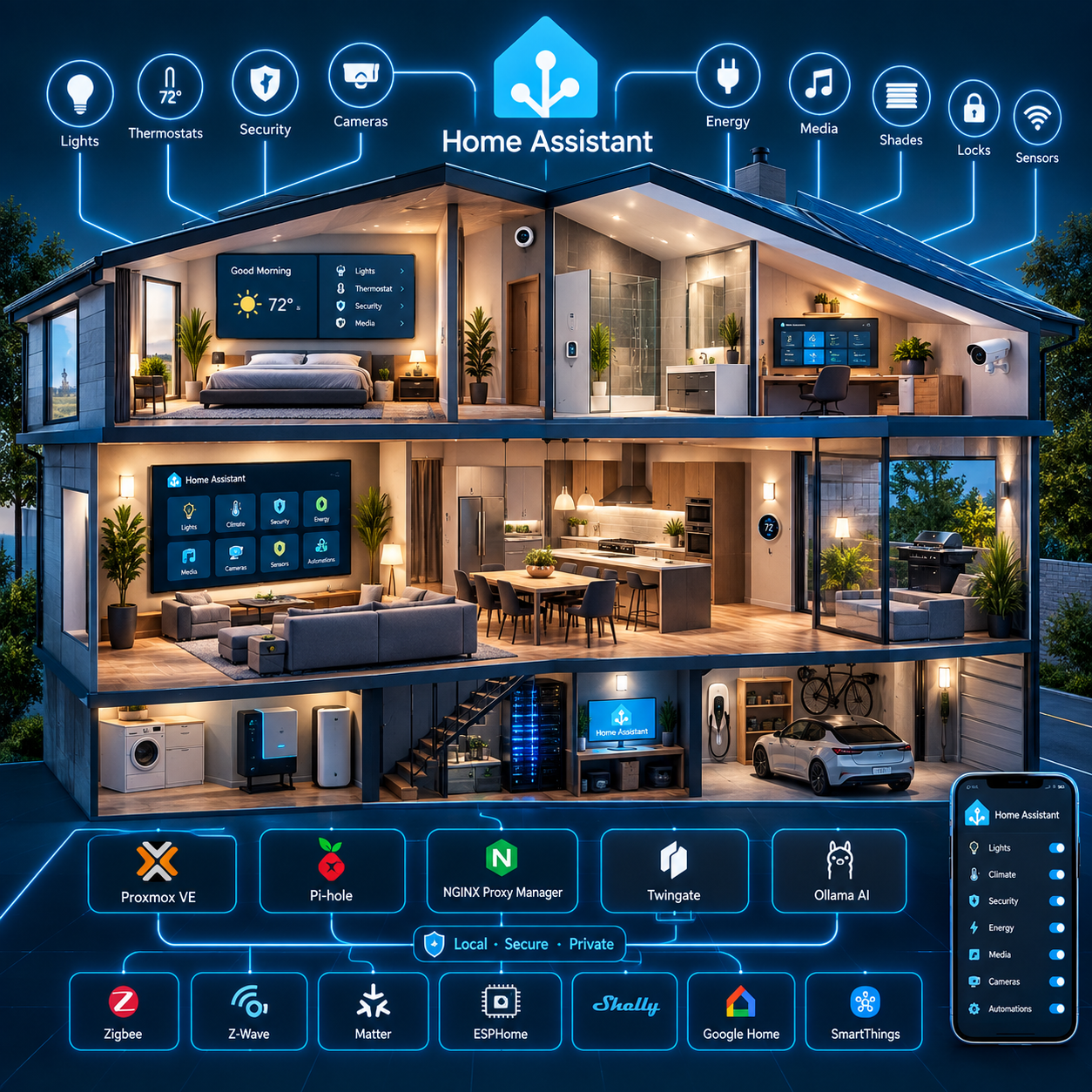
: A Home Assistant Smart Home Integration
Purpose
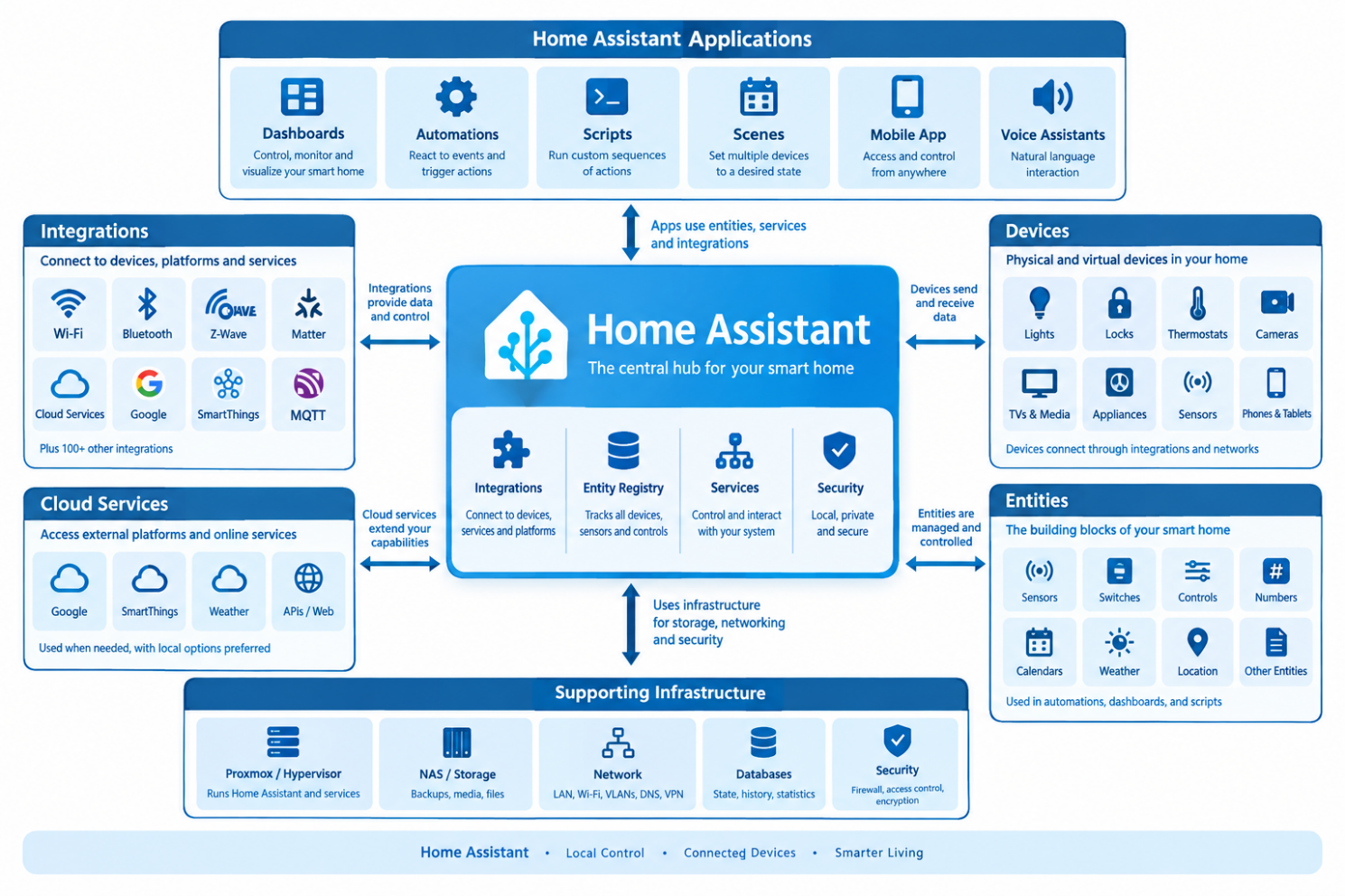
This document explains configuring the basic entities within Home Assistant These entities are used to interact with the devices within your home. The sub level web pages (dashboards) use these entities and devices surrounding the Home Assistant installation.
Foundation
The Home Assistant installation is implemented as a Home Assistant OS (HAOS) virtual machine hosted on the Home Lab Compute Module running Proxmox VE 9.2.3.
Home Assistant is intended to serve as the central home-automation platform and, over time, the primary local voice-assistant platform.
Relationship with the Infotainment Module
Home Assistant is hosted on the Compute Module, while centralized persistent storage and backup services are hosted on the separate Infotainment Module.
The Infotainment Module runs its own Proxmox VE 9.2.3 environment and provides centralized storage through Samba-NAS LXC 100. It also hosts media, document, photo, database, download, and other application services.
This creates a two-node system architecture:
Compute Module (This module)
Home automation, AI, voice, DNS, reverse proxy, and remote-access services.
Infotainment Module
Centralized storage, media, documents, photos, databases, backups, and supporting applications.
The configuration is defined by establishing a foundation then by applying categories of devices into a common desktop. This document establishes this foundation and will consist of setting up Areas Labels and Zones, Cloud Services, Voice Services, People, Networks, Specific Home Details, System Logs, Backups, Entity ID's, AI Tasks, Development Labs, System Storage.
HACs provides addon tools and cards and will be discussed in this document as an initial configuration, but the full HACs configuration will be discussed during each individual Dashboards as they are implemented.
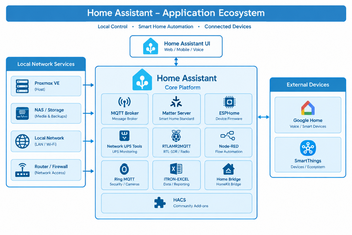
The overall recommended system ecosystem will be discussed, and we will explain how to install and configure this base Eco-system. This includes the various tools used to manage Home Assistant and how these tools integrate within the system.
Architectural Design Goals
The Home Assistant architecture has the following primary goals:
This screen is the starting point when things boot and are sitting idle. This idle position will provide the user a simple quick overview of the entire system including date, time, weather both now and projected weekly and for the next 4 hours. A calendar view is also available on this screen to show what is planned for today and the next 2 days. It will allow the user to get to every device in the entire system within 2 clicks (or less) and will allow you to return to this screen with 2 (or less) clicks. The wall panel is a fixed height and width screen to make the design simple. There will eventually be a designated phone screen as well. The goal is to provide as much information as possible while keeping a clean organized look and feel.
Constraints
Applications
Configuration Files
(starting at the /configurations directory
configuration.yaml (the base configurations file)
templates.yaml (the configurations.yaml file calls this file)
common/button_card_templates/default_colors.yaml (template file for standard colors used through-out all desktop)
common/button_card_templates/spinning_fan (adds a dspinning fan icon when true)
common/button_card_templates/standard.yaml (template file for standard colors used through-out all desktop)
Dashboard Blocks
Header
common/panels/main/header.yaml (the header section of all desktops used in this section)
Buttons
common/panels/main/buttons.yaml (the buttons section of all desktops used in this section)
Lights
Fans
Outlets
Media
Network
Proxmox
Printers
Security
Survailence
Water
Climate
Guages
Alerts
UPS
Energy
Integrations
Devices
Sensor.date_time_formatted (not used but created for future use)
sensor.formatted_date
sensor.formatted_time
group.people
Themes
Cards
custom:button-card
vertical-stack
custom:layout-card
grid
/dash-main_panel/dash-main-panel.yaml
/dash-map/map-panel.yaml
/dash-calendar/calendar_panel.yaml
Desktop Design
The Main page is the main focal point of the entire Home and Home lab system.
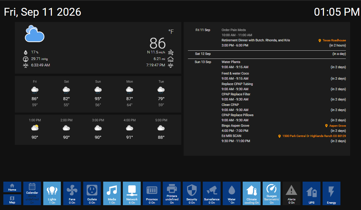
In this figure you can see there are 3 main blocks. The Header Block, the Main block and the Buttons Block. These yaml files are included in the zip file located here:
Header Block
The Header Block is just a simple vertical-stack with a custom:layout-card and 2 custom:button cards
type: vertical-stack |
|---|
This will create a vertical-stack (row) with a grid area that contains 2 cells (columns) the cells are 3.5fr and 1.75fr wide. This will provide a layout to insert the date and time. This block has been assigned the name of header using the line grid-area.
Inside this stack we will insert the date entry.
- type: custom:button-card |
|---|
This block of yaml will insert the sensor.formatted_date object with a bunch of color, size, with the state showing the actual value.
Next inside that stack we will insert the time entry.
- type: custom:button-card |
|---|
This block of yaml will insert the sensor.formatted_time object with a bunch of color, size, with the state showing the actual value.
Date and Time Template
The formatted date and time sensor values must be created since they are not defaults inside of Home Assistant. Home assistant uses the real date and time using the expression called now().
This is how we do the conversion using the templates.yaml file
- sensor: |
|---|
Buttons Block
The Buttons block is a little more complex because it contains a18 different buttons.
type: vertical-stack |
|---|
This will create a vertical-stack (row) with a grid area that contains 18 cells (columns) the cell width will be computed from the screen width value and will fill the entire screen. This will provide a layout to insert a set of buttons. This block has been assigned the name of buttons using the line grid-area.
Button 1 (People)
- type: vertical-stack |
|---|
This block of yaml will insert a button called People using the group.people entity. Two important things to note here are the group entity and the fact that the aspect ratio is set to allow two rows in this same cell. So, this single cell will contain the People button and the Map button. If the People button is clicked it will open the /dash-main-panel/main-panel .
The group entity is defined in the \configuration\groups.yaml file. This file contains a lot of group definitions. For this illustration we are only interested in the group.people entuty which is defined as:
People: |
|---|
Therefore, if either person.edwin or person.kathy is set to home the color scheme will be set to the on state. This group entity will have a value of not_home or home. If it is home then the value will show the on state where not_home will show the off state. This is important since these states are defined in the templates "default_colors.yaml" file as follows:
Default Colors Template
default_colors: |
|---|
The states are the conditional lines that define the colors associated with each state. The labels are defined here as well. The variables section up front defines the actual styles where the logic will apply the style as necessary to the individual button.
Icons
It is also noteworthy to see that each button has an assigned icon. Icons can be browsed by using the https://pictogrammers.com/library/mdi/ website. These icons are already downloaded and installed in your Home Assistant installation and all you need to do is pick one and point to it by using the "icon:" entry
Button 2 (Maps)
- type: custom:button-card |
|---|
This block of yaml will insert a button called Maps using the same group.people entity. It is pretty much the same as the people button except when clicked it will open the /dash-map/map-panel. If possible, this panel will show the location of the people in the groups.people entity.
Button 3 (Calendar)
- type: custom:button-card |
|---|
This block of yaml will insert a button called Maps using the same group.people entity. It is pretty much the same as the people button except that when clicked it will open the /dash-calendar/calendar_panel. If possible, this panel will open the extended calendar Dashboard.
Buttons (4-16)
At this point we have discussed 2 ½ block buttons and a single cell button. From here we just discuss thaechanges in the files and you can look in the attached file for the exact code.
| Name | Entity | Icon | value_on | value_off | Navigation_path |
|---|---|---|---|---|---|
| Lights | sensor.lights | mdi:lightbulb-group | true | false | /dash-lights/lights-panel |
| Fans | sensor.fans | Add spinning_fan template | true | false | /dash-lights/lights-panel |
| Outlets | sensor.outlets | mdi:power-socket-us | true | false | /dash-outlets/outlets-panel |
| Media | Sensot.madia | mdi:music | true | false | /dash-media/media-panel |
| Network | sensor.network | mdi:network | true | false | /dash-network/network |
| Proxmox | sensor.proxmox | mdi:nas | true | false | /dash-proxmox/proxmox |
| Printers | sensor.printers | mdi:printer | true | false | /dash-printers/printers |
| Security | sensor.alarm | mdi:security | true | false | /dash-security/dash-security.yaml |
| Survailence | sensor.cameras | mdi:cctv | true | false | /dash-survailence/survailence |
| Water | sensor.rachio | mdi:water | true | false | /dash-water/dash-water.yaml |
| Climate | sensor.inside_climate | mdi:home-thermometer | true | false | /dash-climate/climate |
| Guages | sensor.outside_climate | mdi:speedometer | true | false | /dash-weather-guages/guages-panel |
| Alerts | sensor.alerts | mdi:alert | true | false | /dash-alerts/alerts-panel |
| UPS | group.people | mdi:home-battery | true | false | /dash-ups/ups-panel |
| Energy | group.people | mdi:flash | not_home | home | /dash-energy/energy |
Now that we have defined the Header and the buttons dashboard blocks we will start defining the main block for each button we have assigned.
Panels
In this section we will discuss how each panel is built. Building web pages is somewhat difficult to get things to align properly. I recommend looking at web documents on how to set up stacks, and grids. Home assistant also has a good section on this. The big trick I learned is that when you have cells that are too high you must shrink the width to reduce the overall height. So, in the sections below where we layout columns and grids if you need to reduce the height just add a column. Jou can create blank cells to do this if desired. Also you can insert pictures to pretty up your page if desired.
Main Panel
The Main panel is basically a 2 column page where column 1 has 3 rows and column 2 is a single row.
type: horizontal-stack |
|---|
This is just a simple horizontal stack and is named main1 so that it fits perfectly inside our main page.
- type: vertical-stack |
|---|
In this column we introduce 2 new card styles. These are card layouts that will need to be loaded using the HACs section of Home Assistant. They are free community developed card layouts that you can use. There are thousands of these layouts for most of all different types of devices and entities. When you are building a Dashboard from scratch search the web to see if someone has already done this. In most cases you can send a developer a request for their code if it is not readily available in the HACs community.
We introduce 2 different weather cards. One is a block with numerous self-contained devices and offers icons that change based on weather patterns. You can change the look and feal of this card by using various flags.
The 1st one uses weather.openweathermap. We can see what is available from the integration. To debug and see what weather.openweathermap provides open the device inside of Home Assistant Settings Devices and select OpenWeatherMap. You will see a list of Sensors that are currently available and the corresponding values. If you do not see the device called Open WeatherMap then check out my paper that discusses Devices Integrations and Entities for detailed instructions.
The next two use a different card and format use but the same device. A different look at the same thing.
Main Page - Calendar
Now we look at the second column. This is also using a card from the HACs collection. In this Device we create a set of different calendars using the google calendar integration. We point this integration to various accounts that we wwnt to monitor. These accounts are then loaded as a list into the custom:atomic-calendar-revive card. Each calendar will come up using a different color.
- type: custom:atomic-calendar-revive |
|---|
At the end of this column, we modify the default font size since there is a lot of text coming in from the calendars. This needs a new front end from the HACs collection called card_mod. This works with most cards but not always. You need to understand the exact variable name that you want to modify. In this case we want to modify font_size. Other cards may use different names for the same thing. You need top lo look at the documents in the HACs repository to see if they provide the variable names. You can also search the web to see if anyone else had the same issue and what their workaround was.
Calendar
Calendar uses the same 2 column stack layout as the main page but instead calls 2 different pages. These pages also use different cards. One in the basic calendar provided by Home Assistant and the other is a new card front-end from HACs called custom:calendar-card-pro. We use the same devices and entities but again view them differently. We also modify the font_size in the first card but that does not work for the second. The custom:calendar-card-pro front end provides its own variables that you can modify directly.
Lights, Fans and Outlets
Since Lights Fans and Outlets are all based on large groups of devices I have placed all of these in the Main Front End section. I will create a separate document that discusses the other tabs individually since they are more complex.
Setting up these pages will provide you with a basic understanding of how things are grouped together to create pages.
So let's get started
These should go quickly since they are mostly the same.
# lights |
|---|
We have seen this structure before. It is a 4-row grid with 3 columns in each row. The width of the columns is different for each row to format the main page with the same width. Row 1 contains 1 column with 5 buttons, 1 column with 2 buttons and the 3rd column with 5 buttons.
We will look at the accents.yaml file in the common/panels/lights/ folder and we see
type: custom:button-card |
|---|
This again is a stack that will read in the 5 files (since the accents column has 5 buttons in it). These buttons are in the common\cards\accents\lights folder. The files are alphabetized and each file will point to the individual light sensor. These files are pretty basic with the entity-name-and template. The template defines what colors show up and the icons used. If there are any special features they are defined in this template file.
type: custom:button-card |
|---|
To get the details on these you can just look at the directory names. The actual files are provided in the attached file.
References and Authoritative Resources
Home Assistant Frontend Core Documentation
Lovelace UI Documentation
Publisher: Home Assistant Project
Frontend Development Guide
Publisher: Home Assistant Project
Custom Lovelace Cards Development
Publisher: Home Assistant Project
Themes and Styling Guide
Publisher: Home Assistant Project
Panel iframe Integration
Publisher: Home Assistant Project
Web Standards & Performance
Web Content Accessibility Guidelines (WCAG) 2.2
Publisher: World Wide Web Consortium (W3C)
Core Web Vitals Metrics
Publisher: Google Web.dev
HTTP/2 and Performance Optimization
Publisher: Mozilla Developer Network (MDN)
Responsive Web Design Fundamentals
Publisher: W3C
Progressive Web App (PWA) Checklist
Publisher: Google Web.dev
Smart Home UI/UX Standards
Matter User Interface Guidelines
Publisher: Connectivity Standards Alliance (CSA)
Apple HomeKit Design Guidelines
Publisher: Apple Developer
Google Smart Home Design Principles
Publisher: Google Developer
Security & Deployment
Content Security Policy (CSP) Reference
Publisher: Mozilla Developer Network (MDN)
SameSite Cookie Attributes
Publisher: IETF
OWASP IoT Top 10
Publisher: OWASP Foundation
Home Assistant Frontend Security Hardening
Publisher: Home Assistant Project
Additional Resources
Home Assistant Frontend GitHub Repository
Publisher: Home Assistant Project
Lovelace Card Registry (Community Maintained)
Publisher: Home Assistant Community
Browser Developer Tools Guide
Publisher: Google Chrome Developers
Web Accessibility Evaluation Tools List
Publisher: W3C
Home Assistant Community Frontend Forum
Publisher: Home Assistant Community
Home Assistant Release Notes (Frontend Updates)
Publisher: Home Assistant Project
Material Design Components for Web
Publisher: Google
SVG Animation and Interaction Guide
Publisher: W3C
JSON Schema for UI Configuration Validation
Publisher: IETF
Web Performance Budgeting Guide
Publisher: Google Web.dev
IoT Dashboard Design Patterns
Publisher: Nielsen Norman Group
Home Assistant OS Kiosk Mode Documentation
Publisher: Home Assistant Project
Accessible Rich Internet Applications (WAI-ARIA) 1.2
Publisher: W3C
Service Workers for Offline Capability
Publisher: Mozilla Developer Network (MDN)
Home Assistant Community Lovelace Examples
Publisher: Home Assistant Community
Web Vitals Measurement in Practice
Publisher: Google Chrome Team
Home Assistant Configuration Validator (for frontend)
Publisher: Home Assistant Project
CSS Custom Properties (Variables) Guide
Publisher: W3C
Home Assistant OS Browser Compatibility Matrix
Publisher: Home Assistant Project